The Web Chat launcher is the floating entry point that visitors use to open the Web Chat interface on your website. YS Desk lets you customize the launcher’s icon, position, shape, text, animation, visual effects, and spacing.
Launcher configuration is managed from the YS Desk dashboard. The launcher itself is rendered on the host website, while the Web Chat interface opens separately when the launcher is selected.
Launcher Overview
The launcher provides the primary entry point for Web Chat visitors.
It can appear as a circular button, pill, tab, rounded square, glass-style control, or other supported visual style. It can also display launcher text, attention animations, unread indicators, and message preview information.
The launcher is rendered directly on the host website rather than inside the Web Chat interface. Its styles are isolated from the host page using Shadow DOM, which helps prevent website CSS from affecting the launcher.
Launcher Interaction
When a visitor selects the launcher:
- The Web Chat interface opens.
- The launcher changes to its open-state presentation.
- Launcher attention animations are suspended while the chat is open.
- The visitor can interact with the Web Chat conversation.
When the Web Chat is closed, the launcher returns to its closed-state presentation.
Accessing Launcher Settings
In the YS Desk dashboard, open:
Settings → Chatbox Settings → Chat Launcher
The page header is:
Chat Launcher
with the description:
Customize how and where the chat launcher appears on your website
The launcher configuration page contains the launcher style, position, text, visual effects, and spacing controls.
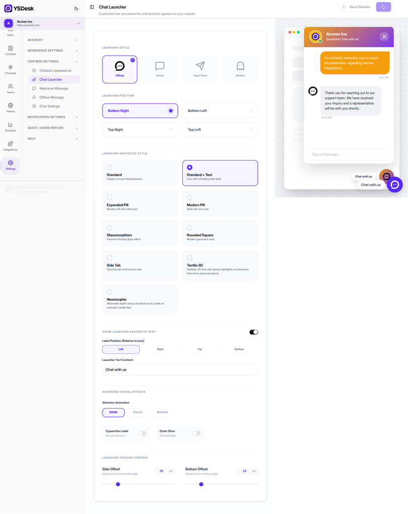
Figure WC-16 — The YS Desk Chat Launcher configuration interface showing icon styles, positions, aesthetic styles, animation controls, offsets, and the desktop live preview.
Configuring the Launcher
Launcher Icon Style
The Launcher Style setting controls the icon displayed inside the launcher.
The available options are:
| Option | Description |
| Official | Uses the YS Desk brand mark as the launcher icon. |
| Classic | Uses a speech-bubble style icon. |
| Paper Plane | Uses a paper-plane style icon. |
| Modern | Uses a ghost-style icon. |
The default option is Official.
Launcher Position
The Launcher Position setting determines which corner of the browser viewport contains the launcher.
Available positions:
| Position | Description |
| Bottom Right | Default position in the lower-right corner. |
| Bottom Left | Lower-left corner. |
| Top Right | Upper-right corner. |
| Top Left | Upper-left corner. |
The default position is Bottom Right.
Understanding Bottom Offset
The Bottom Offset setting controls the vertical distance between the launcher and the nearest vertical edge of the viewport.
For bottom positions, it controls the distance from the bottom edge.
For Top Right and Top Left, the same setting controls the distance from the top edge.
This means there is no separate top-offset setting in the current launcher configuration.
Launcher Aesthetic Styles
The Launcher Aesthetic Style setting controls the overall shape and presentation of the launcher.
YS Desk currently provides nine styles:
| Style | Description |
| Standard | Classic circular floating button. |
| Standard + Text | Circular launcher with an external floating text label. |
| Expanded Pill | Wide pill containing the icon and inline text. |
| Modern Pill | Wide pill presentation without the external floating label. |
| Glassmorphism | Frosted glass-style launcher with configurable blur. |
| Rounded Square | Rounded square launcher with a geometric appearance. |
| Side Tab | Narrow launcher attached directly to the side of the viewport. |
| Tactile 3D | Three-dimensional launcher with glossy highlights and depth effects. |
| Neumorphic | Soft, extruded launcher using light and shadow for depth. |
Selecting an aesthetic style can also change how launcher text is displayed.
Standard
The Standard style uses a circular launcher and normally displays only the icon.
Standard + Text
The Standard + Text style uses a circular launcher together with a separate floating text label.
Expanded Pill
The Expanded Pill style places the launcher text directly inside the pill alongside the icon.
Modern Pill
The Modern Pill style provides a wider pill-shaped launcher without the standard external floating label.
Glassmorphism
The Glassmorphism style applies a frosted glass appearance.
When this style is selected, the Glass Blur Strength control becomes available.
Rounded Square
The Rounded Square style uses a rounded geometric launcher instead of a circular button.
Side Tab
The Side Tab style docks the launcher directly against the left or right edge of the viewport.
Tactile 3D
The Tactile 3D style provides a physical button appearance with highlights, shadows, and a pressed interaction state.
Neumorphic
The Neumorphic style uses soft opposing shadows to create an extruded appearance.
Launcher Text & Placement
Launcher text can be controlled independently from the launcher icon.
Show Launcher Aesthetic Text
The Show Launcher Aesthetic Text switch controls whether the launcher displays text.
Default:
Enabled
When disabled, launcher text is not displayed.
Launcher Text Content
The Launcher Text Content field controls the text displayed by supported launcher styles.
Default:
Chat with us
Text Position for Expanded Pill
When Expanded Pill is selected, the dashboard displays:
Text Position (Relative to Icon)
Available values:
- Left
- Right
This controls the position of the text inside the pill.
Label Position for Other Styles
For launcher styles other than Expanded Pill, the dashboard displays:
Label Position (Relative to Icon)
Available values:
- Left
- Right
- Top
- Bottom
This positions the text as an external floating label around the launcher.
The two controls are different because Expanded Pill places text inside the launcher, while other supported styles can display it as a separate floating label.
Typewriter Label
The Typewriter Label switch adds an animated text-entry effect to the launcher label.
Default:
Disabled
When enabled, supported launcher text is displayed using the typewriter entrance animation.
Attention Animations & Visual Effects
The Advanced Visual Effects section provides additional launcher effects.
Attention Animation
The Attention Animation setting provides:
- None
- Pulse
- Wiggle
The default is None.
Pulse creates a repeating scale animation to draw attention to the launcher.
Wiggle creates a repeating rotational animation.
When the Web Chat interface is open, these attention animations are suspended.
Glass Blur Strength
The Glass Blur Strength control is available when Glassmorphism is selected.
Range:
0–40 px
Default:
12 px
Higher values produce a stronger frosted-glass effect.
Outer Glow
The Outer Glow switch adds a soft branded glow around the launcher.
Default:
Disabled
Viewport Spacing & Offsets
The launcher provides two spacing controls.
Side Offset
Side Offset controls the horizontal distance from the nearest side of the browser viewport.
Default:
20 px
The dashboard provides:
- Slider range: 0–100 px
- Numeric input range: 0–500 px
Bottom Offset
Bottom Offset controls the vertical distance from the nearest vertical edge of the browser viewport.
Default:
20 px
The dashboard provides:
- Slider range: 0–100 px
- Numeric input range: 0–500 px
For top-positioned launchers, Bottom Offset represents the distance from the top edge of the viewport.
Side Tab Positioning
When Side Tab is selected, the launcher is docked directly against the selected side of the viewport. The launcher therefore does not use the normal side spacing in the same way as floating launcher styles.
Launcher Behavior
Unread Notifications
The launcher can provide visual notification states when new activity occurs while the Web Chat interface is closed.
An unread pulse effect can appear around the launcher when an incoming Agent message arrives.
Opening Web Chat clears this launcher notification state.
Online Indicator
The launcher can display an online indicator showing that an active Web Chat session or online state is available.
The indicator is hidden while the Web Chat interface is open.
Message Preview
When an Agent message arrives while the Web Chat interface is closed, the launcher can display a message preview containing the Agent information and message text.
Selecting the preview opens Web Chat.
Resolved Conversation Prompt
When a Conversation is resolved, the launcher can display a follow-up preview allowing the visitor to open the conversation again.
Mobile Behavior
The launcher adapts its presentation on smaller screens.
On mobile screens:
- External floating launcher labels are hidden.
- The launcher is hidden while the Web Chat interface is open.
- The launcher remains available when the Web Chat interface is closed.
- Touch-friendly launcher dimensions are maintained.
The mobile-specific behavior is handled by the Web Chat launcher itself and does not require a separate mobile launcher configuration.
SDK Runtime Controls
The Web Chat SDK exposes launcher-related configuration properties, but not every declared option currently provides an effective runtime control.
A supported SDK initialization can include launcher configuration such as:
window.YSDeskSDK(‘run’, {
token: ‘YOUR_CHANNEL_TOKEN’,
launcher: {
iconUrl: ‘https://cdn.example.com/custom-chat-icon.svg’
}
});
Runtime Option Availability
The current SDK accepts launcher properties including:
- launcher.iconUrl
- launcher.show
- launcher.tooltip
- launcher.size
However, their current behavior differs:
launcher.iconUrl can provide a fallback icon URL when a dashboard launcher icon is not supplying the final launcher icon.
launcher.show is accepted by the SDK configuration, but the current launcher implementation still creates the launcher during initialization. It should therefore not be treated as a reliable way to hide the launcher.
launcher.tooltip is accepted by the SDK configuration but is not currently rendered as a native browser tooltip or HTML title attribute.
launcher.size is currently declared in the SDK types but does not control the launcher dimensions.
Do not rely on these partially implemented properties for production launcher behavior until their runtime behavior is explicitly supported.
Removing the Launcher
The public SDK provides:
window.YSDeskSDK.destroy();
This removes the Web Chat iframe and the launcher from the host page.
The SDK does not currently expose public:
window.YSDeskSDK.open();
window.YSDeskSDK.close();
methods for directly opening or closing Web Chat.
Visitors open and close Web Chat through the launcher and the widget interface.
Dashboard and SDK Configuration Precedence
Launcher visual settings configured in the YS Desk dashboard are authoritative.
For properties that exist in both dashboard configuration and SDK theme configuration, the dashboard values override the SDK values when the channel configuration is loaded.
For example:
window.YSDeskSDK(‘run’, {
token: ‘YOUR_CHANNEL_TOKEN’,
theme: {
launcherPosition: ‘bottom-right’
}
});
If the dashboard is configured with Bottom Left, the dashboard configuration is applied.
The general rule is:
SDK Defaults
↓
SDK Runtime Fallbacks
↓
YS Desk Dashboard Configuration
↓
Effective Launcher Configuration
Client-only runtime options that have no corresponding dashboard setting remain controlled by the SDK.
Saving and Resetting Launcher Settings
Save Changes
Launcher changes are edited in the dashboard and saved using:
Save Changes
The settings interface tracks unsaved changes.
If you attempt to leave the page while launcher settings are still unsaved, YS Desk displays:
Discard Unsaved Changes?
The dialog provides:
Keep Editing
and
Discard Changes
Reset Defaults
The Reset Defaults control applies only to the launcher configuration when you are on the Chat Launcher section.
Clicking Reset Defaults immediately restores and persists the launcher defaults.
The launcher defaults include:
- Launcher Icon: Official
- Position: Bottom Right
- Side Offset: 20 px
- Bottom Offset: 20 px
- Launcher Text: Chat with us
- Aesthetic Style: Standard
- Label Position: Left
- Text Position: Right
- Show Launcher Aesthetic Text: Enabled
- Attention Animation: None
- Typewriter Label: Disabled
- Glass Blur Strength: 12 px
- Outer Glow: Disabled
Resetting launcher settings does not reset unrelated branding settings such as the Web Chat primary color or launcher icon color.
Applying Launcher Changes
Launcher configuration is loaded when the Web Chat SDK initializes.
When an administrator changes launcher settings:
Administrator Updates Launcher Settings
↓
Settings Saved
↓
Channel Configuration Updated
↓
Next Web Chat Initialization
↓
Updated Launcher Rendered
Changes to the launcher are not applied to an already-rendered floating launcher in an open visitor browser session.
A visitor with an existing page open will receive updated launcher settings after the host page is refreshed or navigated to a new page.
The Web Chat interface itself can receive supported configuration updates independently, but the floating launcher is created in the host website page during SDK initialization.
Plan Availability
Launcher customization requires the Starter plan or above.
Free Plan
Free plan workspaces still display the Web Chat launcher on their websites.
However, the launcher uses the system defaults and cannot be customized through:
Settings → Chatbox Settings → Chat Launcher
The dashboard displays the upgrade state instead of the launcher customization controls.
Starter, Growth, and Enterprise
The Chat Launcher configuration page is available for workspaces on supported paid plans, beginning with Starter.
Launcher Configuration Reference
| Setting | Default | Available Values / Range |
| Launcher Style | Official | Official, Classic, Paper Plane, Modern |
| Launcher Position | Bottom Right | Bottom Right, Bottom Left, Top Right, Top Left |
| Launcher Aesthetic Style | Standard | Standard, Standard + Text, Expanded Pill, Modern Pill, Glassmorphism, Rounded Square, Side Tab, Tactile 3D, Neumorphic |
| Show Launcher Aesthetic Text | Enabled | Enabled / Disabled |
| Launcher Text Content | Chat with us | Text |
| Label Position | Left | Left, Right, Top, Bottom |
| Text Position | Right | Left, Right |
| Attention Animation | None | None, Pulse, Wiggle |
| Glass Blur Strength | 12 px | 0–40 px |
| Typewriter Label | Disabled | Enabled / Disabled |
| Outer Glow | Disabled | Enabled / Disabled |
| Side Offset | 20 px | 0–500 px |
| Bottom Offset | 20 px | 0–500 px |
The exact text-position control shown in the dashboard depends on the selected launcher aesthetic style.
Launcher Preview
The Chat Launcher configuration page includes a desktop live preview.
The preview reflects supported launcher configuration changes while editing the settings.
Use the preview to review:
- launcher icon
- position
- launcher style
- text
- animations
- visual effects
- spacing
The preview is intended to help review the launcher configuration before saving.
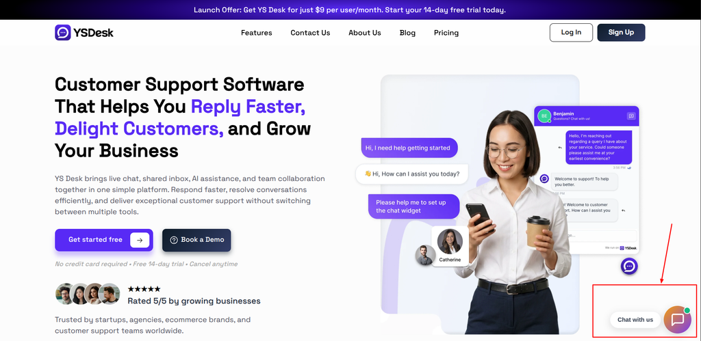
Figure WC-17 — The Web Chat launcher rendered on a website in its floating closed state.
Need Help?
Email: support@ysdesk.com
Documentation: https://docs.ysplugins.com/ys-desk